The Hague & Partners is the umbrella organization for The Hague Marketing Bureau, The Hague Convention Bureau, and The Hague Business Agency, the official marketing organizations promoting The Hague as a leisure, conference, and business destination. I contributed to their brand identity in 2016 as part of an agency team. Since 2019, I've worked directly with them, developing their secondary visual language and creating materials for reports, events, and campaigns.
Client
The Hague & Partners
Agency
Happy Folk
Services
Visual identity systems
Editorial and print design
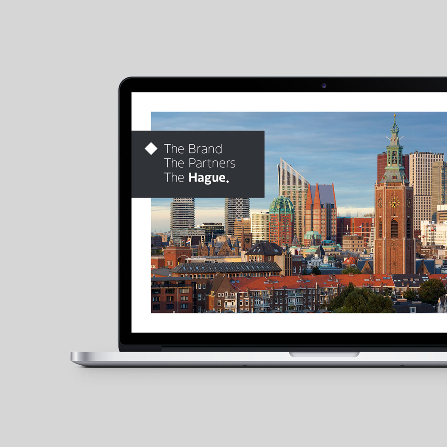
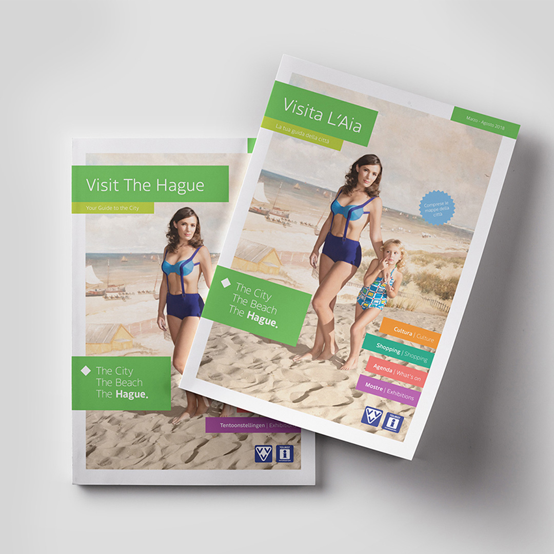
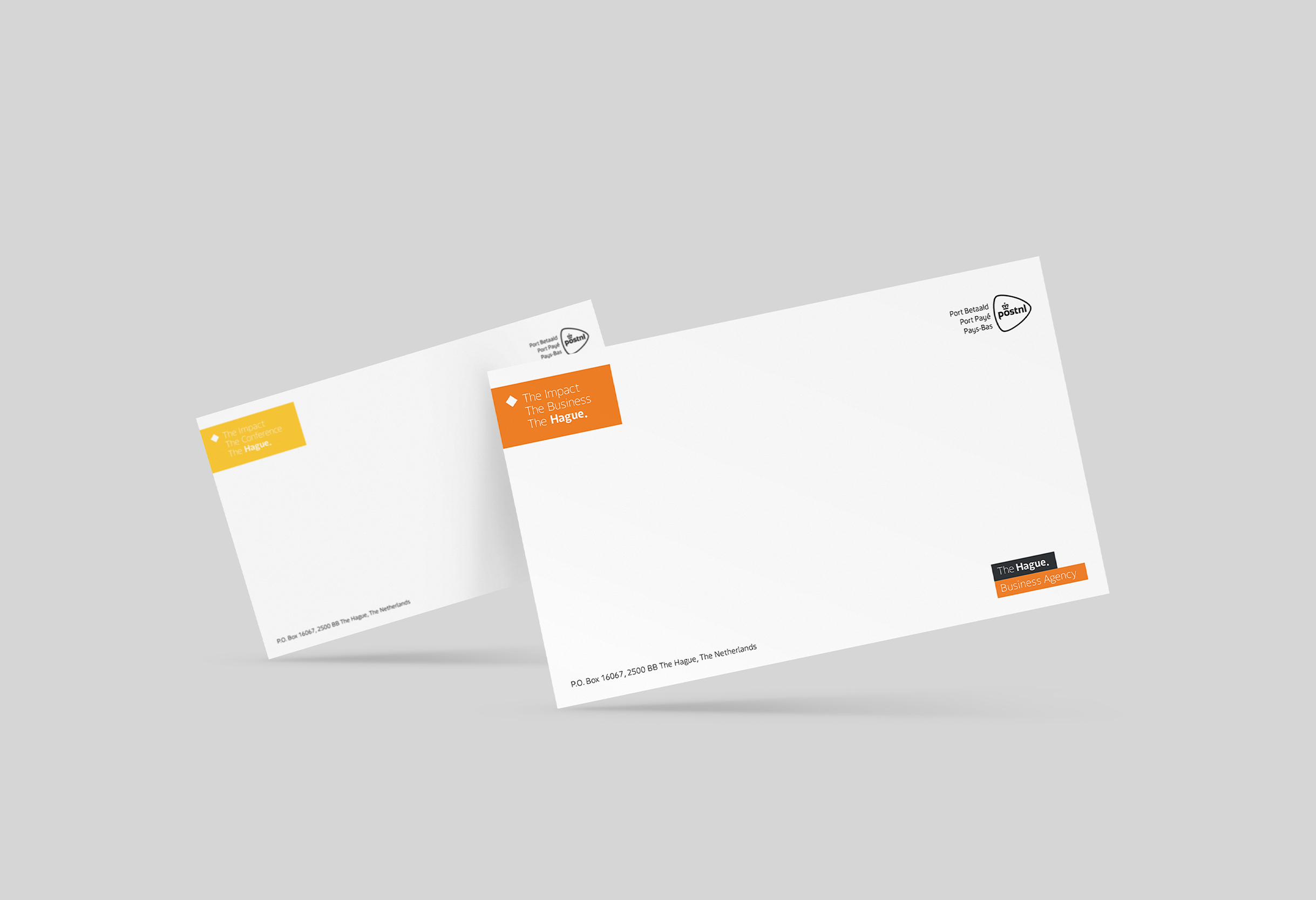
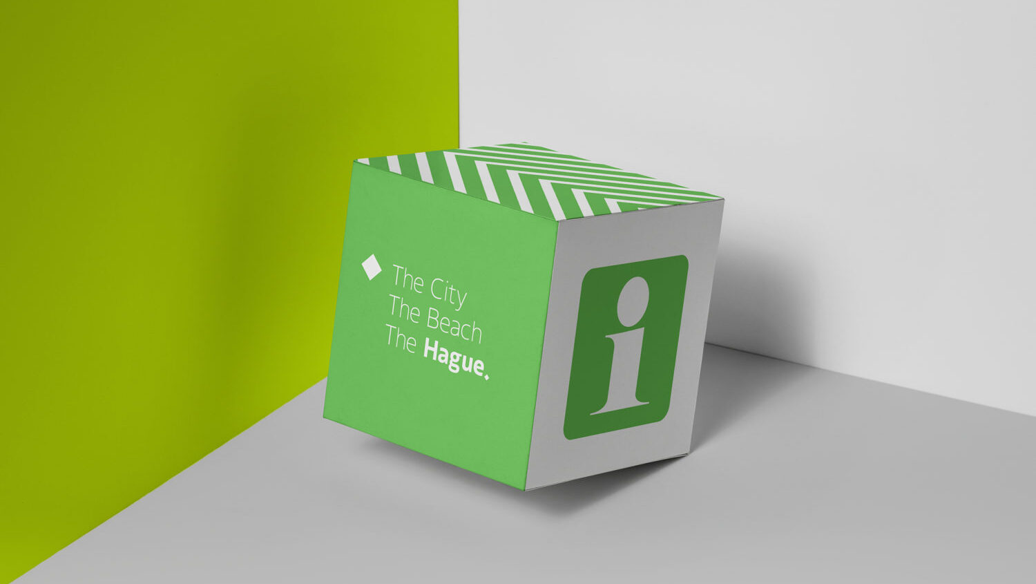
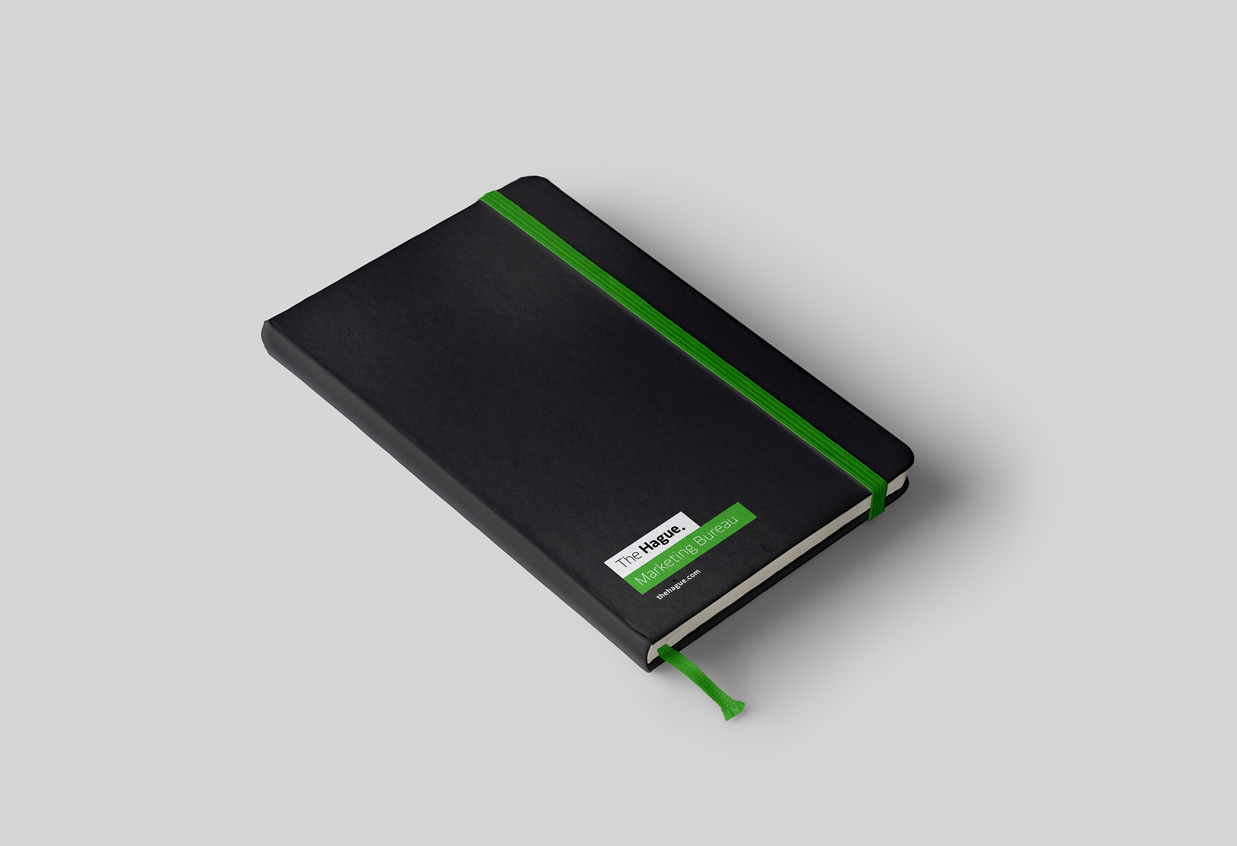
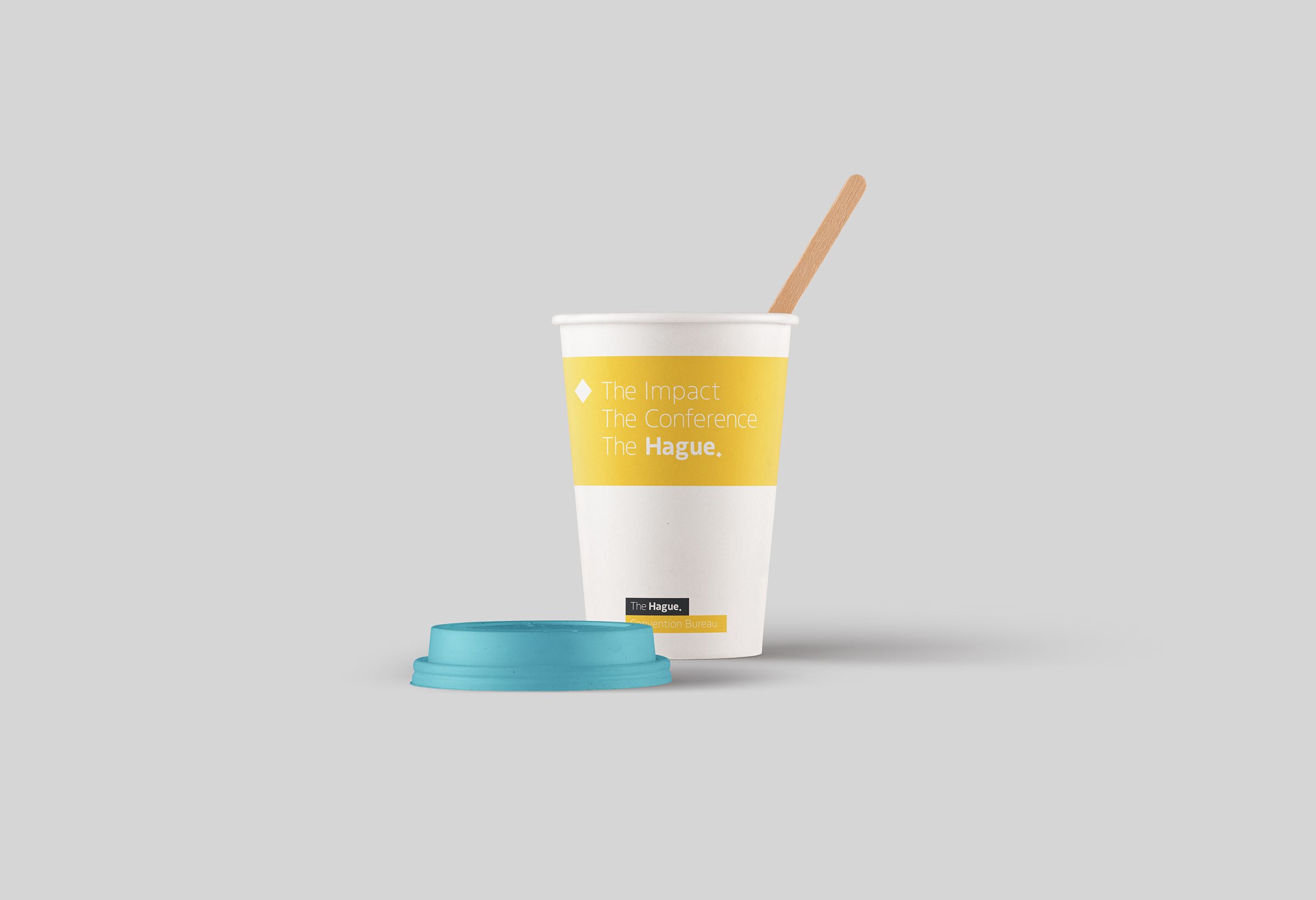
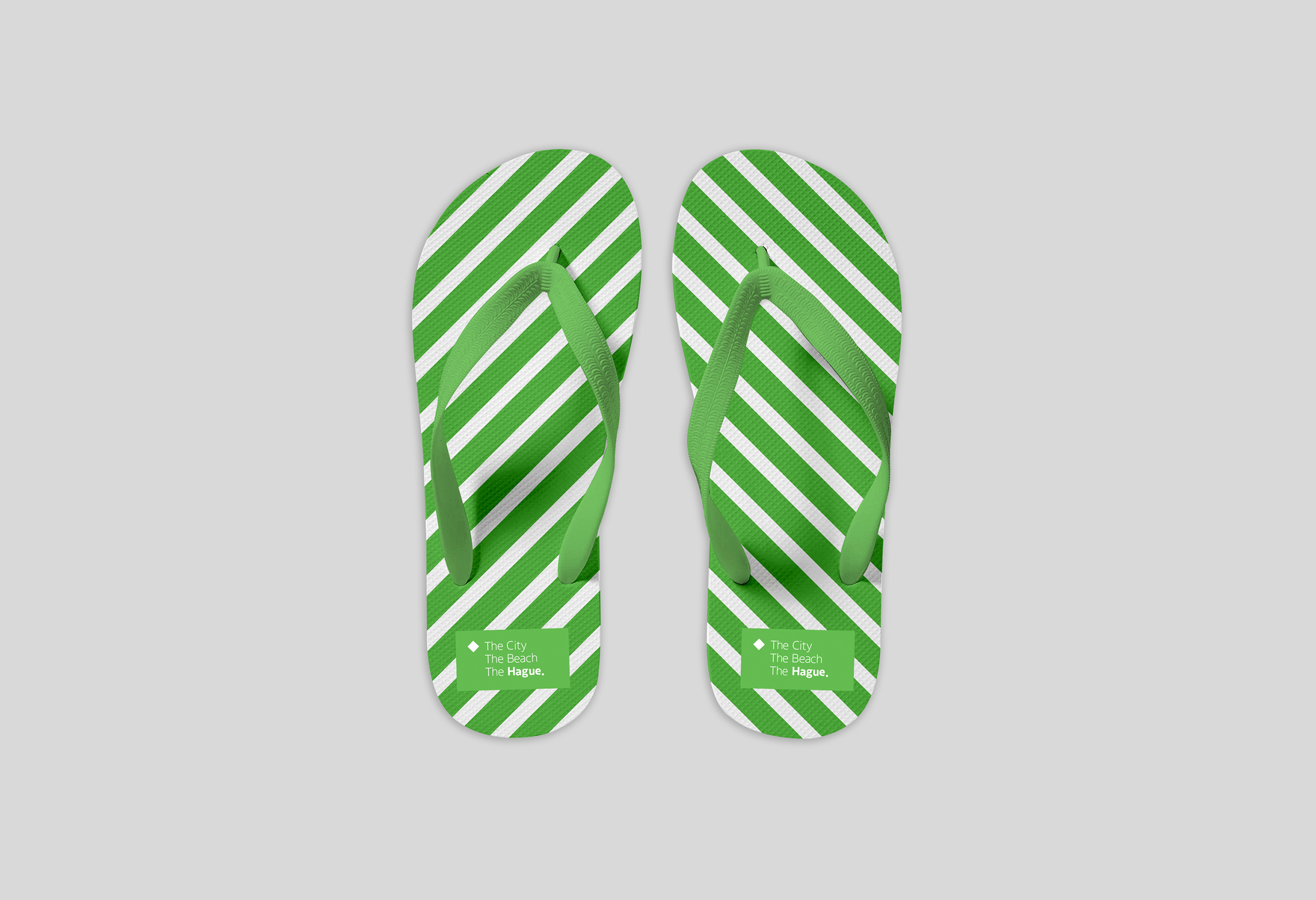
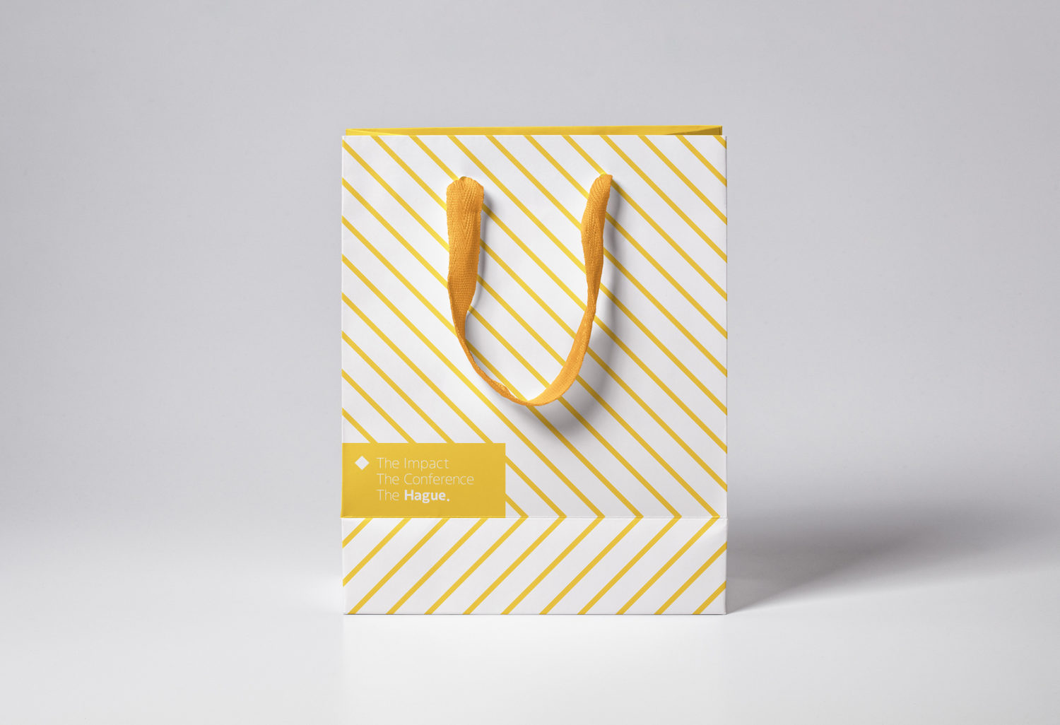
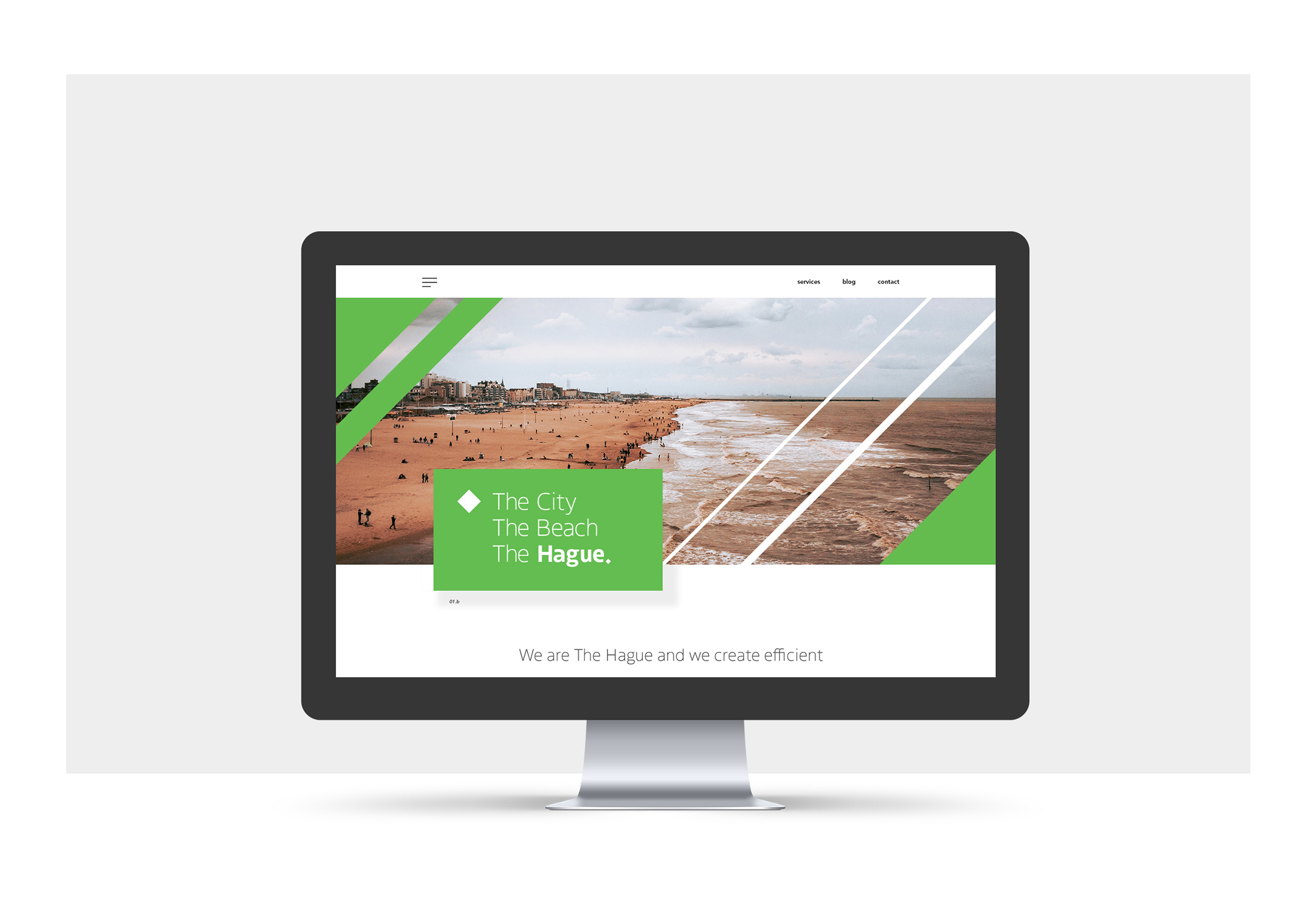
Each partner organization is identified by a color-coded sticker element that contains the rhombus icon and wordmark, creating consistency across the system while allowing each bureau to maintain its own distinct identity.
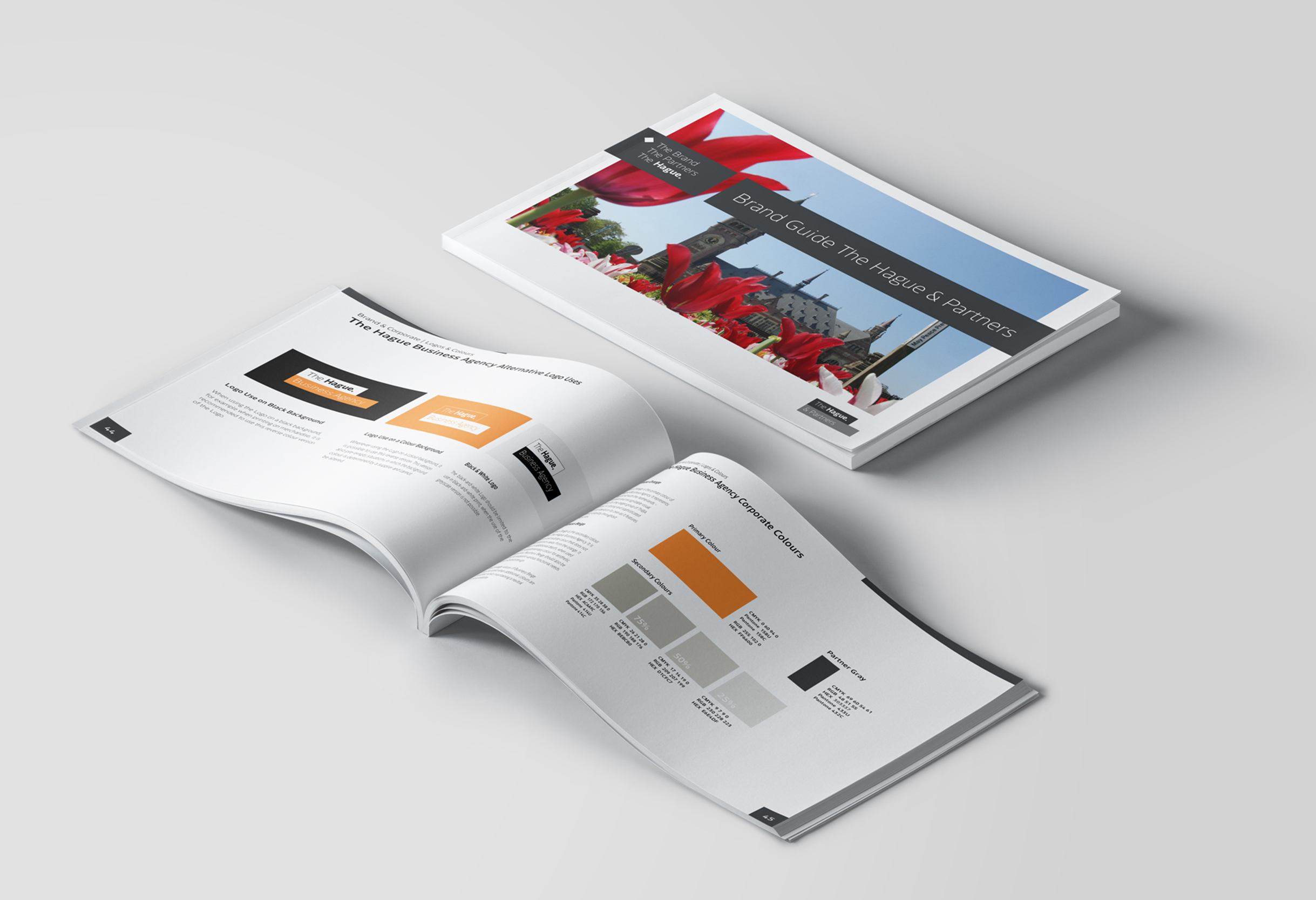
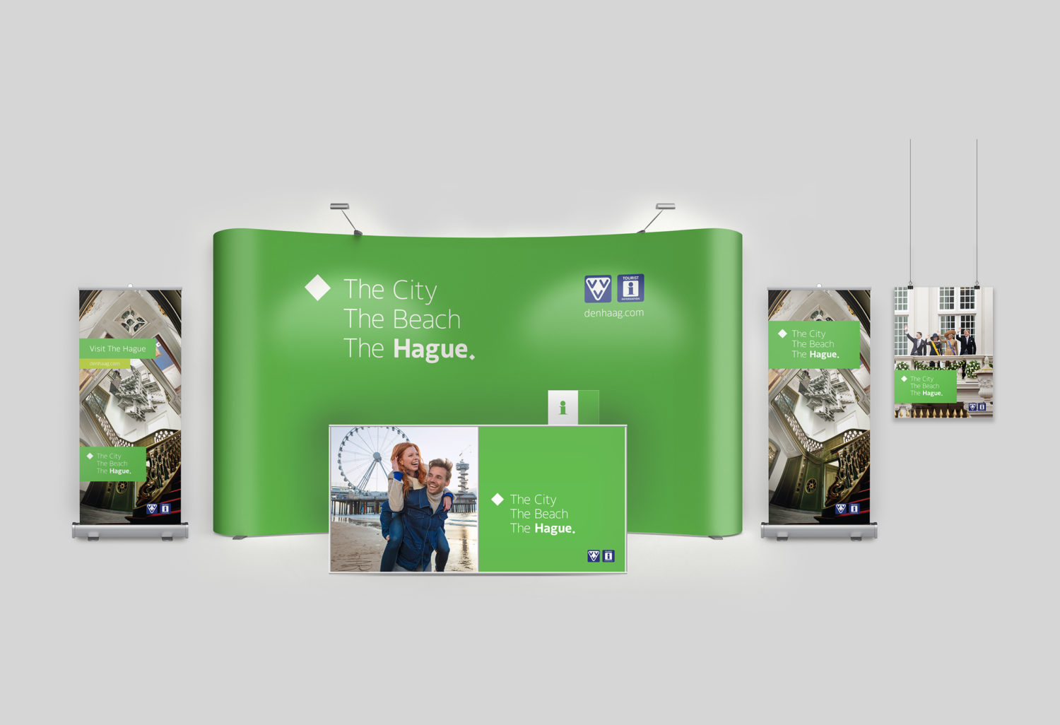
The three partner logos share the same typeface, color system, and emphasis on "The Hague," allowing each organization to operate independently while remaining visually connected.
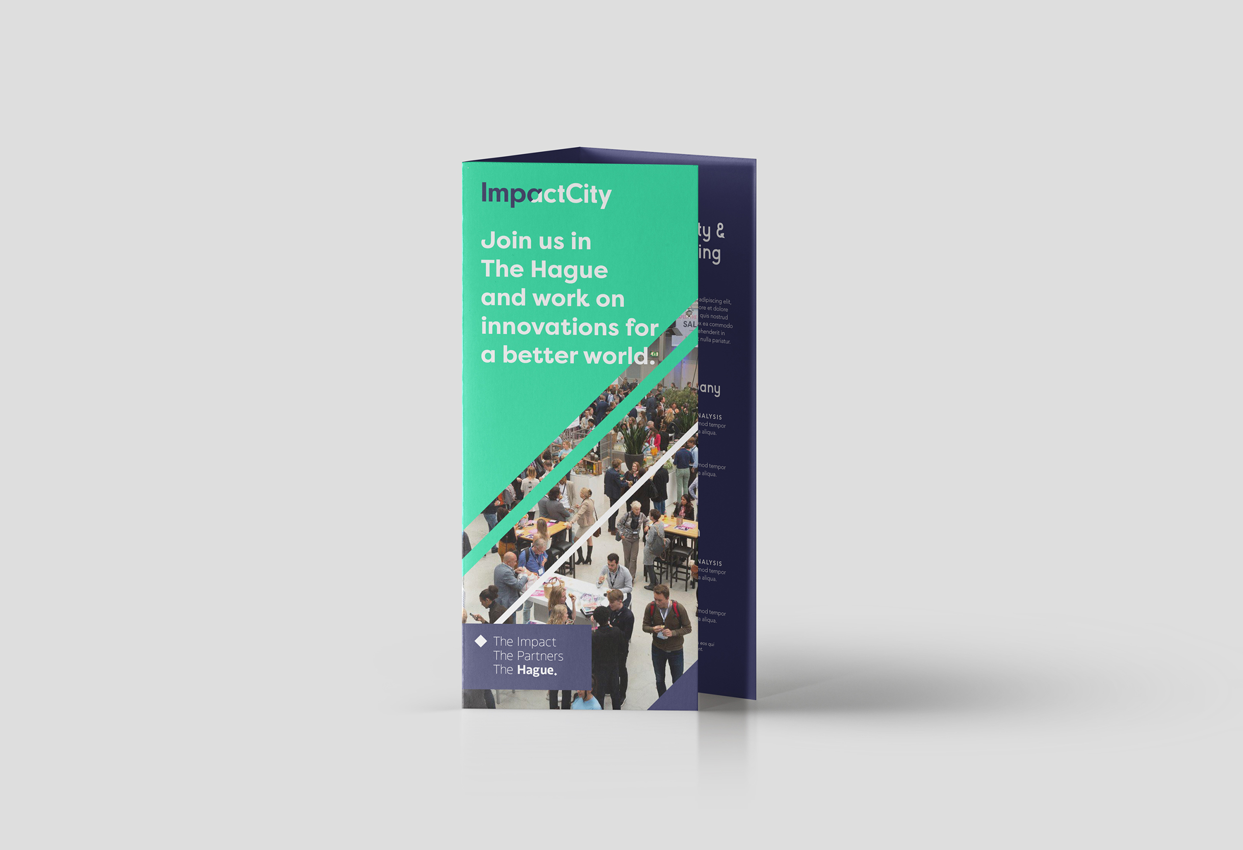
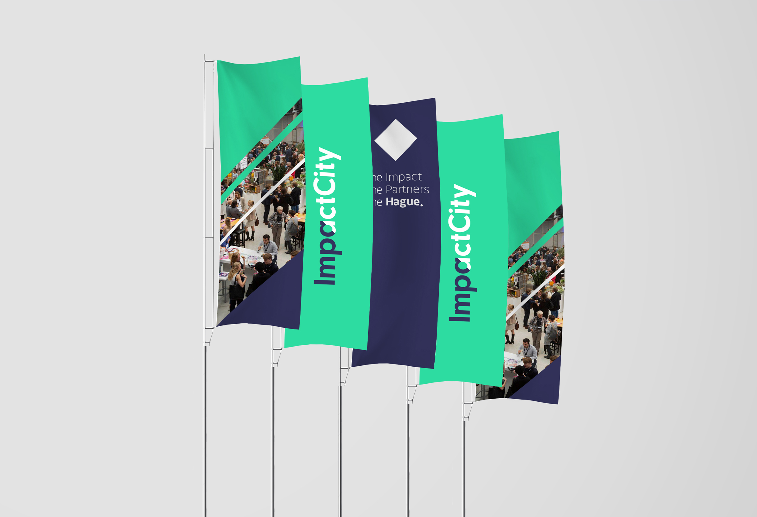
The challenge was creating a flexible system that could work across three organizations and extend to third parties for city-wide communications. The visual language later became the foundation for The Hague's city branding.

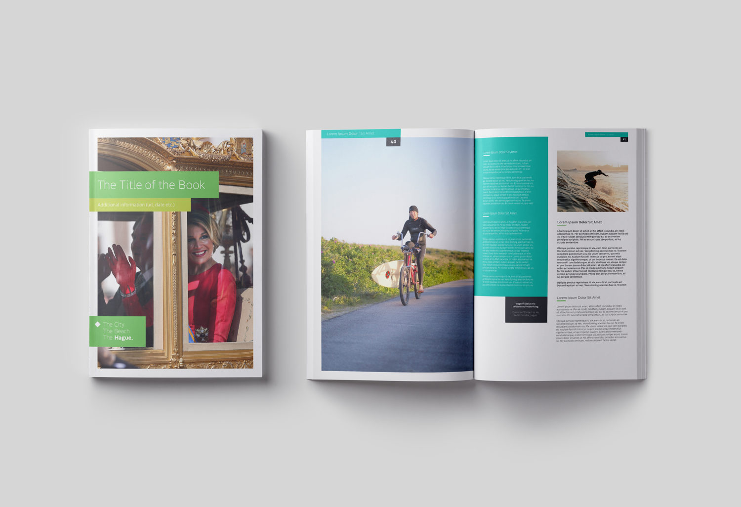
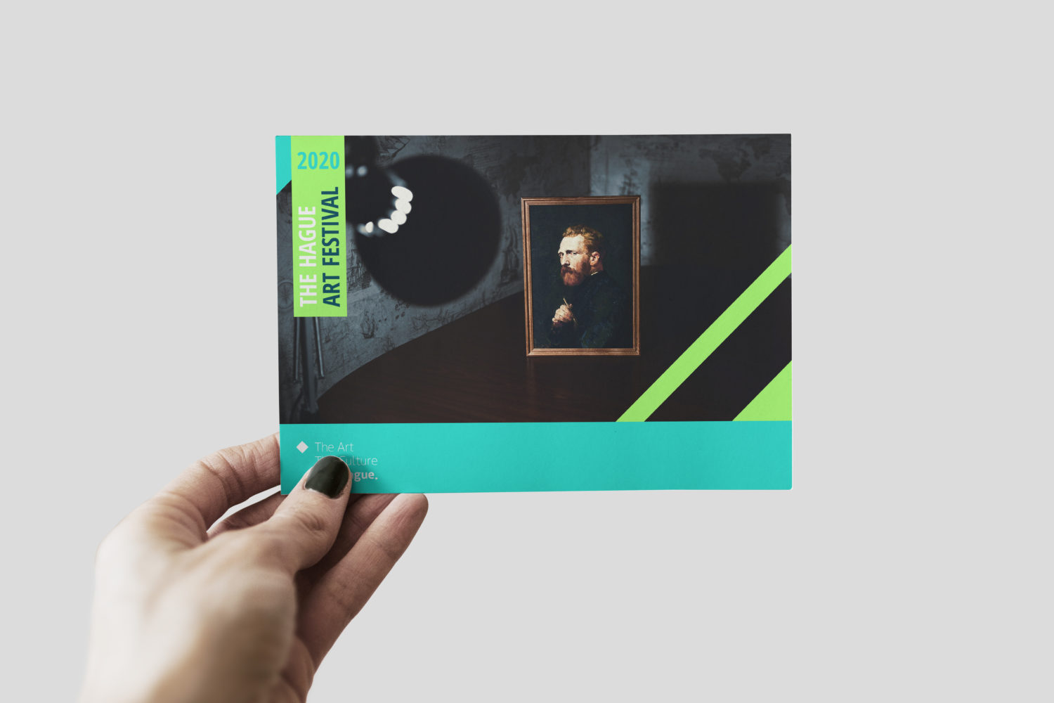
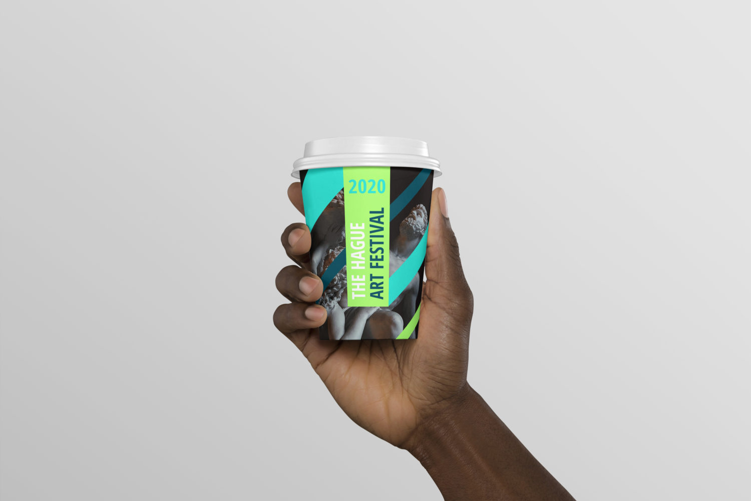
I later developed a secondary visual language that extends the core identity system. The Hague Art Festival is a speculative campaign showcasing how the system adapts to different contexts and media.

Last updated May 2026